

Why Is My SaaS Product Not Converting?
5 UX Problems That Kill Growth
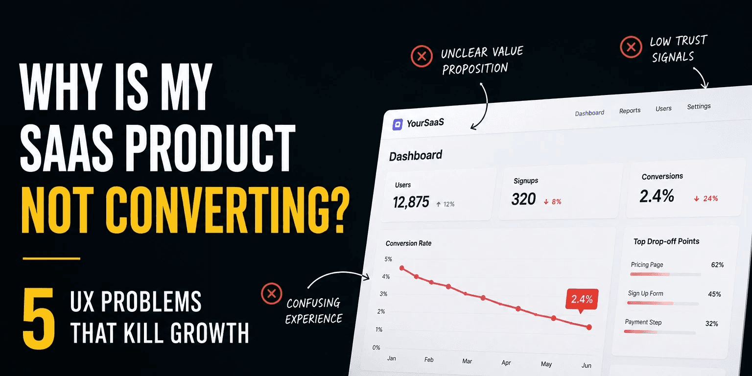
If your SaaS product gets traffic but users don’t convert, the issue is often not marketing - it’s friction, confusion, or trust. Many products lose users within seconds because people don’t immediately understand the value, next step,
or why they should care.
Research shows users form a first impression of a website in as little as 50 milliseconds. That means users often decide whether your product feels relevant and trustworthy before they even start reading.
At Matan, I’ve seen the same pattern repeatedly across startups: strong ideas, solid technology, and smart teams - but a product experience that quietly hurts growth.
Do Users Understand What Your Product
Actually Does?
0%
0%
of purchasing decisions happen subconsciously, heavily influenced by emotion and perception.
“People ignore design that ignores people.”
-Frank Chimero
Image name goes here
Is Your Onboarding Asking for Too Much Too Early?
Many SaaS products lose users before they ever experience value.
The reason?
Too many questions. Too many setup steps. Too much friction.
Users should experience an “aha moment” as quickly as possible.
If onboarding feels like work, people leave.
Ask yourself:
Do users need to create an account immediately?
Are you requesting unnecessary information?
Can users experience value before setup?
The best onboarding flows reduce effort and increase momentum.
A simple principle works surprisingly well:
Don’t ask for commitment before delivering value.
Think about products people love using. Most of them guide users progressively instead of overwhelming them from the beginning.
Are Users Confused About What to Do Next?
Confused users do not convert. Many startup websites and products fail because they create too many competing actions.
Book a demo.
Read more.
Watch a video.
Explore features.
Start free trial.
Everything becomes important. Which means nothing becomes important.
Good product design reduces decisions.
Your interface should guide users toward one primary next action.
Ask yourself:
Is the primary CTA obvious?
Is there visual hierarchy?
Does every section support one goal?
A clean experience creates confidence. And confidence drives action.
10-10Seconds
10-10Seconds
WHat it takes for users to often leave websites if they don’t immediately find value or direction.
“Good design is obvious. Great design is transparent.”
- Joe Sparano
Does Your Product Feel Trustworthy Enough?
Users judge credibility instantly. Even strong products struggle when the experience feels inconsistent, unclear, or unfinished.
Small details matter:
Weak visuals
Generic copy
Poor hierarchy
Missing social proof
Users ask themselves:
“Can I trust this?”
before asking:
“Do I need this?”
Sometimes improving trust signals creates a bigger impact than shipping new features.
Quick Check:
Are testimonials visible?
Is the messaging clear?
Does the product look polished?
Is the UI consistent?
Are You Solving The Wrong Problem Beautifully?
A polished interface cannot fix a weak problem. Many startups redesign screens before validating whether users actually care about the problem being solved.
Before redesigning:
Talk to users
Review drop-off points
Watch session recordings
Validate assumptions
Great design improves the right product.
It doesn’t rescue the wrong one.
“Design is not just what it looks like.”
- Steve Jobs
Final Thoughts
If your SaaS product is not converting, the issue is usually not one dramatic mistake.
It’s small friction points adding up:
Unclear messaging
Heavy onboarding
Confusing navigation
Weak trust signals
Small UX improvements often create outsized business impact.
Sometimes growth doesn’t require rebuilding the product.
Just removing friction.
References
Nielsen Norman Group (NN/g)
Google UX Research
McKinsey Design Index
Stanford Web Credibility Research

