Emotional Consistency:
The Hidden Retention Engine in Product Design
In product design we obsess over usability scores, feature parity,
and interaction micro-optimizations.
But in real life, users don’t stay because every feature is perfect.
They stay because the product feels the same way every time they open it.
This consistency in emotional experience - how the product feels - is one of the most overlooked retention levers in modern SaaS and digital products.
1. Why Emotional Consistency Matters
Emotional consistency isn’t about aesthetics or brand colors - it’s about how every part of your product communicates predictability and psychological safety.
When a user feels the same emotional rhythm throughout a product journey, something interesting happens:
Predictability builds trust. When the emotional tone never shifts unpredictably, users commit with less hesitation.
Stability reduces cognitive load. A consistent emotional experience feels easier -
even if the product isn’t technically simpler.Emotion shapes habit. People build routines around how a product makes them feel, not just what it technically does.
Consistency compounds. Over time, stable emotional patterns become part of the product’s identity, strengthening long-term loyalty.
2. A Real Design Case: The SaaS That Felt Disjointed
A few months ago I worked with a mid-stage SaaS product that was struggling with early retention - not because of missing features, usability issues, or performance problems.
Everything was “good enough” on paper.
Yet users weren’t returning.
We dug into the experience - and the pattern was clear:
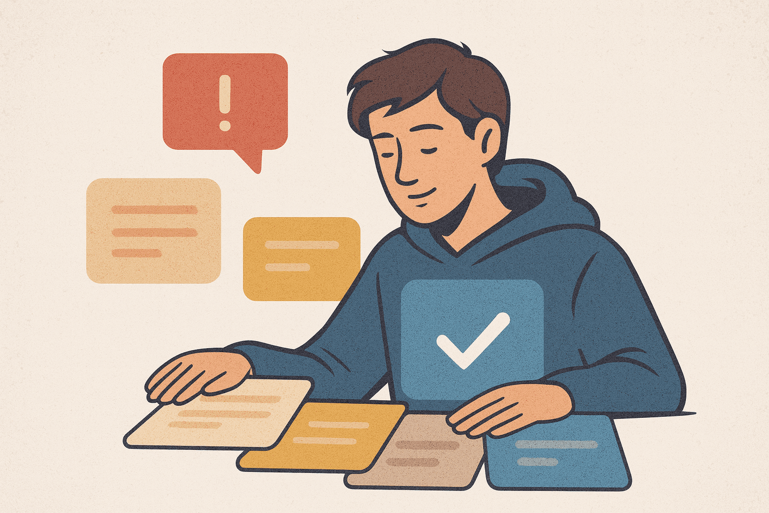
Different screens felt like they belonged to different products:
Copy that sounded friendly and supportive in one flow…
Suddenly shifted to urgent, sales-driven messaging in another.
Micro-interactions were smooth in onboarding but jarring in settings.
Tone of feedback changed from calming to abrupt.
Nothing was technically broken - but emotionally the product felt inconsistent.
After we aligned the emotional tone across key flows - unifying voice, visual rhythm, and micro-interaction cadence - something shifted:
Next-day return rates climbed by over 25%.
No new features. No big redesign. Just a consistent emotional experience.
3. How to Design for Emotional Consistency
Here’s the practical part. You can start applying this today:
• Audit Your Emotional Landscape
Look beyond UI to how every touchpoint feels. Are alerts friendly or aggressive?
Is feedback supportive or cold?
Document the emotional gaps.
• Define a Product Emotional Style Guide
This is like a brand style guide, but for experience emotion: tone of copy, animation pacing, feedback intensity, error wording, and their psychological impact.
• Align Micro-Interactions
Details matter. Consistent velocities, easing curves, motion patterns, and response timing
all contribute to a predictable emotional cadence.
• Test Emotion, Not Just Usability
Include emotional response in your usability tests. Ask: How did that make you feel?
Retention is an emotional KPI.
4. Emotional Consistency Is Not Optional - It’s Strategic
In a world where digital products often feel identical feature-wise,
emotional experience becomes the differentiator.
Products win not by impressing users once -
but by making them feel reliably comfortable coming back.
And that’s retention you can measure on your retention curve -
not just in cool design awards.
Image name goes here
Until Next Time, Keep Designing with Intent
The next time someone says “we just need better features,” ask:
“But do users feel the same way each time they use this product?”
Because consistency isn’t aesthetic.
It’s psychological.
And it’s strategic.


